
Use this framework to reduce chart noise, then study the next setup with a defined question, a defined risk point, and a repeatable review process.
Quick Answer: Your Chart Looks Confusing Because You Are Mixing Context With Noise
Stock charts usually look confusing when the screen has too many indicators, the timeframe does not match the question, or every candle is treated like a standalone signal. The fix is to simplify the chart: zoom out, identify the broad structure, mark important zones, then use only the tools that answer a specific question.
A clean chart is not a prediction machine. It is a better workspace for asking what price has done, where it is reacting now, and what would invalidate the idea.
Watch the Video: Clean Up Your Charts
Watch the original Stackmode lesson first, then use this written guide to slow the process down. The goal is not to remove every tool from every chart. The goal is to make sure every visible tool has a job.
Why Charts Look Noisy Before You Even Make a Decision
A chart becomes difficult to read when several layers of information compete for attention. Moving averages, oscillators, trend lines, alerts, volume panels, and arrows can all be useful in the right context. Together, they can also create a screen where every signal appears to contradict another signal.
The problem is not that the market suddenly became impossible to understand. The problem is that the chart is asking you to process more information than your decision requires.
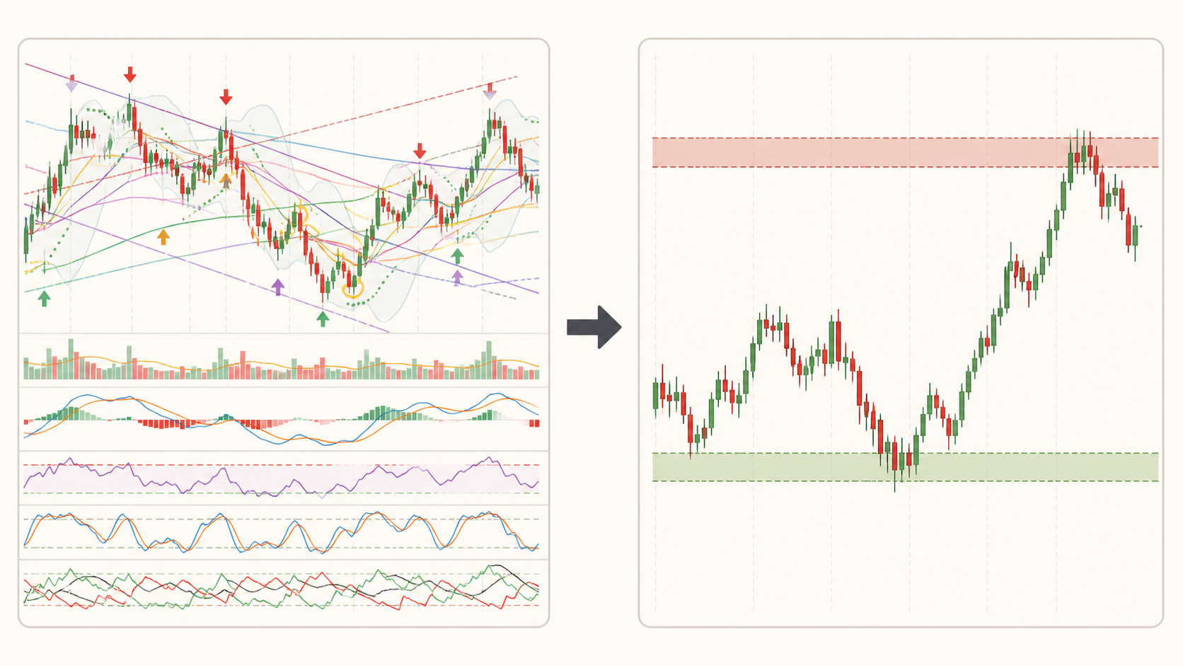
- Repeated tools can make one idea look like five separate confirmations.
- Conflicting timeframes can make normal pullbacks feel like trend reversals.
- Exact lines can create false precision around areas where buyers and sellers actually react across a range.
- Unclear risk turns every small candle into an emotional decision.
Start With Price Before You Add Another Indicator
The clearest first question is simple: what is price doing? Look for higher highs and higher lows, lower highs and lower lows, or a range where price is moving between recognizable boundaries. This gives you a working description of the market before an indicator gives you a label.
This does not make indicators useless. It puts them in the right order. A moving average can help organize trend context. Volume can help you study participation. An oscillator can describe momentum. None of those tools should replace the question you were trying to answer.
Use one question per tool
- Trend question: Is price generally making higher or lower swings?
- Location question: Is price near a zone that mattered before?
- Momentum question: Is the current move expanding or losing energy?
- Risk question: Where is the idea clearly wrong?
Choose the Right Timeframe Before You Interpret the Move
Timeframe changes context. A short-term chart shows more fluctuations, while a higher timeframe compresses those fluctuations and can make the broader swing easier to see. The right timeframe depends on the holding period and decision you are making, not on which chart looks most exciting.
If a five-minute chart looks bearish while a daily chart is still in a larger uptrend, that may be a pullback rather than a contradiction. Start from the timeframe that matches the main decision, then move down only when you need execution detail.
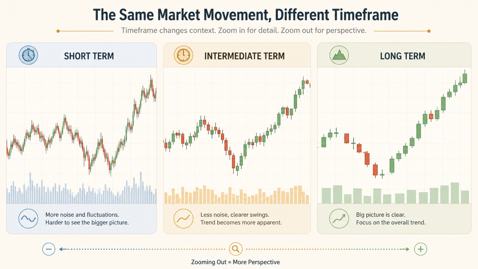
- Choose the timeframe that matches your planned holding period.
- Zoom out enough to identify the broader trend or range.
- Mark the zones that matter on that broader view.
- Only then use a lower timeframe to study a possible reaction.
Read Support and Resistance as Zones, Not Exact Lines
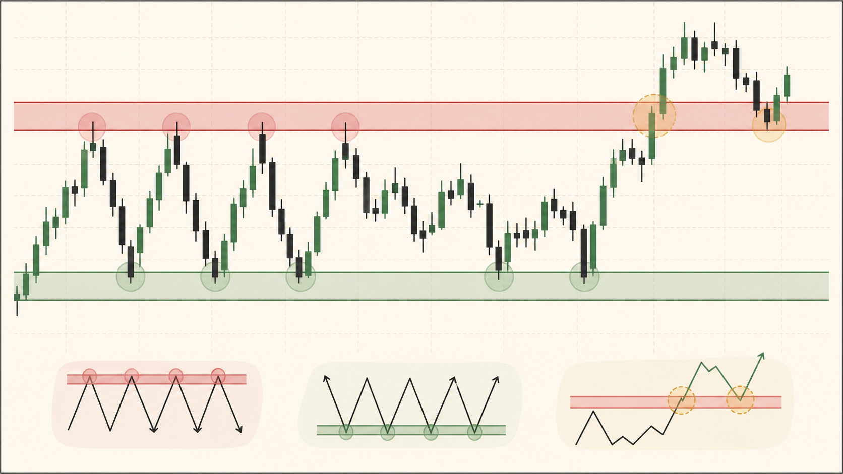
Support and resistance are areas where price has previously slowed, reversed, or found renewed interest. CME Group describes these levels as places where price may pause or change direction, and notes that a broken level can change roles. That is useful context, but it is not a promise that a zone will hold.
Draw zones wide enough to include the actual reactions. If your line is so precise that one wick makes you call the level broken, the chart is encouraging false certainty. Study how price behaves around the area instead.
For more practice, compare this framework with the Stackmode support-zones lesson and the guide to trend and pullback structure.
Use Indicators as Context, Not as Commands
Indicators are calculations derived from price, volume, or both. They can help you organize information, but they do not know your account size, your risk tolerance, the news schedule, or the reason you are in the trade. A signal on an indicator is a prompt to investigate, not an instruction to act.
FINRA explains that market-timing approaches can use technical patterns, quantitative methods, or fundamental analysis, but active decisions still carry uncertainty and can increase trading costs or missed-opportunity risk. That is why a clean chart should end in a defined plan, not a stronger emotional reaction to a flashing signal.
- Keep an indicator only if you can explain what question it answers.
- Remove tools that repeat the same price information.
- Compare the indicator with location and structure instead of reading it in isolation.
- Review the idea without the indicator to see whether the thesis still makes sense.
If indicators are your main source of confusion, read Why Most Trading Indicators Are Useless and the candlestick-pattern guide next.
Five Steps to Clean Up a Confusing Chart
A repeatable sequence keeps chart reading from turning into random clicking. The point is to reduce the number of decisions you make before you know what the chart is showing.
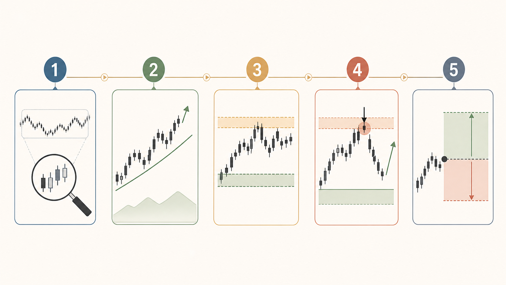
- Zoom out: identify whether the market is trending, ranging, or transitioning.
- Describe the swings: note the recent highs, lows, and direction without predicting the next candle.
- Mark the zones: record the areas where price repeatedly reacted.
- Read the reaction: watch whether price accepts, rejects, or moves through the zone.
- Define risk: decide what would invalidate the idea before you risk capital.
| Confusing chart habit | Cleaner replacement |
|---|---|
| Every indicator must agree | Each tool must answer one useful question |
| One timeframe explains everything | Use higher timeframe context before entry detail |
| A line is exact support or resistance | A zone frames an area of prior reaction |
| A clean setup must win | A clean setup still needs defined invalidation and risk |
Common Chart-Reading Mistakes That Create False Confidence
The most dangerous chart mistakes are not always technical. They are process mistakes that make uncertainty look like certainty. Investor.gov warns that day trading involves substantial risk and that leverage can increase losses quickly. Chart clarity should support risk control, not encourage oversized positions.
- Changing the layout after every result: a process cannot be evaluated if the rules keep moving.
- Zooming in too early: precision without context turns normal noise into a dramatic story.
- Calling a line broken on one wick: zones need confirmation through behavior, not instant certainty.
- Using a signal as a thesis: an indicator can support a reason, but it should not be the entire reason.
- Ignoring the invalidation point: if you cannot say what proves the idea wrong, you do not yet have a complete plan.
Honest limit
A cleaner chart can improve attention and decision structure, but it cannot predict every move or guarantee a winning trade. Technical patterns fail, markets gap, execution can differ from the planned price, and leveraged products can create losses larger than expected. Keep the risk small enough that one chart idea cannot damage the wider plan.
FAQ
Why does my stock chart look confusing?
A chart often looks confusing because it contains too many indicators, too many timeframes, or too much attention on individual candles. Start with the broad trend, then mark the areas where price repeatedly reacted before adding extra tools.
What should I look at first on a stock chart?
Start with the timeframe, overall direction, recent swing highs and lows, and the clearest support and resistance zones. This gives you context before you decide whether any indicator is useful.
How many indicators should a beginner use?
There is no universal number, but a beginner should be able to explain exactly what each indicator measures and what decision it supports. If several indicators repeat the same information, remove the extras and read price structure first.
Why does the chart look different on different timeframes?
Each timeframe compresses the same market activity differently. A short timeframe shows more fluctuations and a long timeframe shows broader structure. The charts are not necessarily disagreeing. They are answering different questions about the same market.
Are support and resistance exact prices?
Usually they are better treated as zones than exact prices. Buyers and sellers can react across a range, and price can briefly move through a zone before rejecting or accepting it.
Can indicators tell me exactly when to buy or sell?
No. Indicators summarize price or volume data and can help organize a decision, but they do not remove uncertainty. A setup still needs context, a defined invalidation point, and risk that fits the account.
Should I use a line chart or candlestick chart?
A line chart can make the broad path easier to see, while candlesticks add information about the open, high, low, and close for each period. Many traders use a simpler view for context and candlesticks when studying a specific reaction.
Does a clean chart guarantee a better trade?
No. A cleaner chart can improve your process by reducing distraction, but it cannot guarantee direction, execution, or profit. Markets can break structure, gaps can occur, and a good-looking idea can still fail.
How do I stop changing my chart every day?
Write down the question your chart is meant to answer, choose a small set of tools, and keep the layout unchanged while you review several examples. Changing the layout after every result makes it harder to tell whether the process is useful.
What is the biggest chart-reading mistake?
The biggest mistake is treating every visible movement as a signal. A chart becomes more useful when you separate context from trigger, use levels as areas, and define what would prove the idea wrong before taking risk.
For the next step, explore StackFinder market tools, Stackmode trading education, or Catch Our Trades to see how a chart-reading process connects to ongoing review.
Best-Fit Framework: What This Topic Can and Cannot Tell You
Why Your Chart Looks Confusing (You're Reading It Wrong) is best understood as an educational framework: define the decision, compare the available choices, verify current evidence, and keep the downside explicit before acting.
| Option or lens | Best for | Honest limit |
|---|---|---|
| Definition | Clarifying what the topic actually means | A definition does not predict a market outcome. |
| Process | Turning the idea into repeatable research steps | A process still depends on execution and current conditions. |
| Risk check | Sizing uncertainty and writing invalidation rules | Risk controls reduce exposure; they do not remove loss. |
Research Checklist and Related Stackmode Lessons
Use primary sources for current rules and the related Stackmode pages for connected market context. The links are learning paths, not promises that a result will transfer from one market or person to another.
Visual Study Opportunities
These are useful visual checkpoints for a future revision or companion graphic. They make the explanation easier to scan without presenting an unverified chart, number, or performance claim as proof.
- 1. A one-sentence definition card with the key term highlighted.
- 2. A labeled process diagram showing research before execution.
- 3. A comparison table with the same criteria across alternatives.
- 4. A before-and-after example that clearly labels assumptions.
- 5. A timeline showing which facts are current and which are historical.
- 6. A risk ladder from low complexity to high complexity.
- 7. A checklist for source, date, cost, liquidity, and invalidation.
- 8. A worked example using hypothetical values rather than a promise.
- 9. A common-mistakes graphic with the correction beside each mistake.
- 10. A final decision tree showing when to pause and verify more evidence.
Expanded FAQ
What is the main idea of this article?
The main idea is to understand why your chart looks confusing (you're reading it wrong) as a process with defined assumptions, risks, and verification steps rather than as a guaranteed outcome.
Who is this article for?
It is for readers who want an educational framework before making a market, trading, or investing decision.
What should a beginner do first?
Start with the definition, identify the instrument or market involved, and write down the risk before thinking about an entry or action.
What information should be verified?
Verify the product rules, current data, costs, timing, liquidity, source date, and any claim that could change the decision.
What is the biggest mistake to avoid?
The biggest mistake is treating an educational explanation as a promise and skipping independent risk checks.
How does risk management fit in?
Risk management sets the position size, invalidation point, maximum loss, and review process before execution.
Can this approach guarantee a profit?
No. Markets are uncertain, and no framework can guarantee a profit or remove loss risk.
How current is this information?
Market rules, prices, products, and policy can change, so check the dated primary source before acting.
Should this replace professional advice?
No. It is general education, not personalized financial, tax, legal, or investment advice.
How should readers compare alternatives?
Compare the same criteria: purpose, issuer, liquidity, costs, volatility, custody, time horizon, and honest limitations.
Conclusion: Use the Framework, Then Verify the Decision
Why Your Chart Looks Confusing (You're Reading It Wrong) is best understood as an educational framework: define the decision, compare the available choices, verify current evidence, and keep the downside explicit before acting. The useful takeaway is not a prediction. It is a repeatable process: define the topic, compare the available choices, verify current sources, size risk conservatively, and record what would change your mind.
Stackmode provides educational market context, not guaranteed returns or personalized financial advice. Recheck current rules, prices, liquidity, and tax implications before acting.
Trading Books
Keep Learning After The Article
Pick the book that matches the skill you want to practice next. Each one gives you a focused framework to work through after this article, with Amazon paperback and eBook options available.
Recommended starting point
Neuro Trading
Master the psychology of trading.
- Why 90% of traders lose and how to think like the 10%
- Emotional discipline techniques used by stronger traders
- A mindset framework built for long-term execution
eBook
$9.99
Paperback
$19.99
Audiobook
$9.99
Before The Hype
How to spot opportunities before they go viral.
- Learn the asset stacking strategy for long-term wealth
- Find high-signal trends before they become crowded
- Think earlier instead of chasing late momentum
eBook
$9.99
Paperback
$19.99
Audiobook
$9.99

Freedom Money
Understand Bitcoin and what it does.
- A cleaner beginner path into Bitcoin
- Protect and grow money with stronger awareness
- Build conviction before you move capital
eBook
$9.99
Paperback
$19.99
Audiobook
$9.99
Build a Cleaner Chart-Reading Process
Pick one clean next action instead of bouncing around the site.
START HERE
Stackmode Trading School
Join the school for live classes, market review, organized lessons, StackFinder access, and member support. $499/year — StackFinder included.
Best value
StackMode Trading School
Live group sessions, stock and crypto market review, organized video lessons, StackFinder access, and a Halal spot-trading framework. $499/year.
Live class plan
Live Group Sessions Included
Bring questions, review charts, and learn the same repeatable process with students moving through the class plan together.
StackFinder
StackFinder Member Tools
AI scanner, personal watchlist, daily stock and crypto setups, dashboards, and trade-prep tools are included with the group.
Education and risk disclosure
Stackmode provides education, tools, examples, and market commentary only. Nothing on this site is personalized financial, investment, tax, or legal advice, and no result, trade recap, screenshot, testimonial, alert, or example is a promise of future performance. Trading and investing involve substantial risk of loss, including the possible loss of capital. You are responsible for your own decisions, position size, broker selection, tax treatment, and compliance with the laws and rules that apply in your location.
Read the full risk disclosure